Livedrive - Design Standards
Establishing a design system for Livedrive
The challenge: Create a system with branding and UI elements that carry across all platforms
Platforms: Web-app (Desktop & Mobile), Mobile apps, Desktop apps
Toolkit: Photoshop, Invision, HTML/SASS, Moodboards
Livedrive's branding, albeit an established one, never had a unified theme that would carry across its omni-channel applications. A project was needed to establish base branding elements and a UI kit to act as a guide for our future project and feature stories.
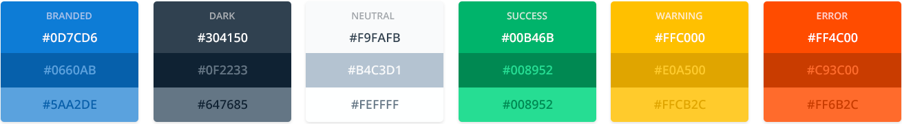
Colour
Livedrive's brand colour was limited to a single bright blue value with no alternatives. My first approach was to create a wider spectrum within the brand constraints, with dark and light variations that could be used throughout the UI.
Based on that bright blue I then created dark and neutral variants. I used Smashing Magazine's method for creating blacks, grays and whites that are harmonious with our single branded colour.

This approach aided us in keeping a unified colour scheme throughout our user interfaces. Elements such as light / dark backgrounds and (when necessary) variations in text colours can be completely managed by those three colours and their darker / lighter variations.
Additional colours
The colours above covered most of our UI needs and provided a unified branded-based look. However, the need for more colours that could signify complex actions, messages or alerts to the users were needed.
As a result, an additional colour scheme was designed. These colours can be used in call to actions, warnings and alerts.
Used sparingly these colours can draw the users' attention to a specific action or keep them informed wherever needed.
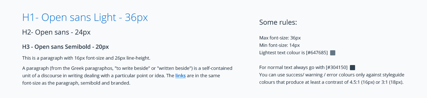
Typography
Livedrive already had some established typography rules. It uses the font Open Sans in several weights and sizes. I simplified these typography rules in a concise layout. By reducing the amount of variation in our type options I hoped that any future project can have all its type needs met whilst keeping it easy for different UIs to bee consistent.
UI Library
These first established rules, helped guide the way towards the creation of a design system with commonly used UI elements that acted as a guide across our products.
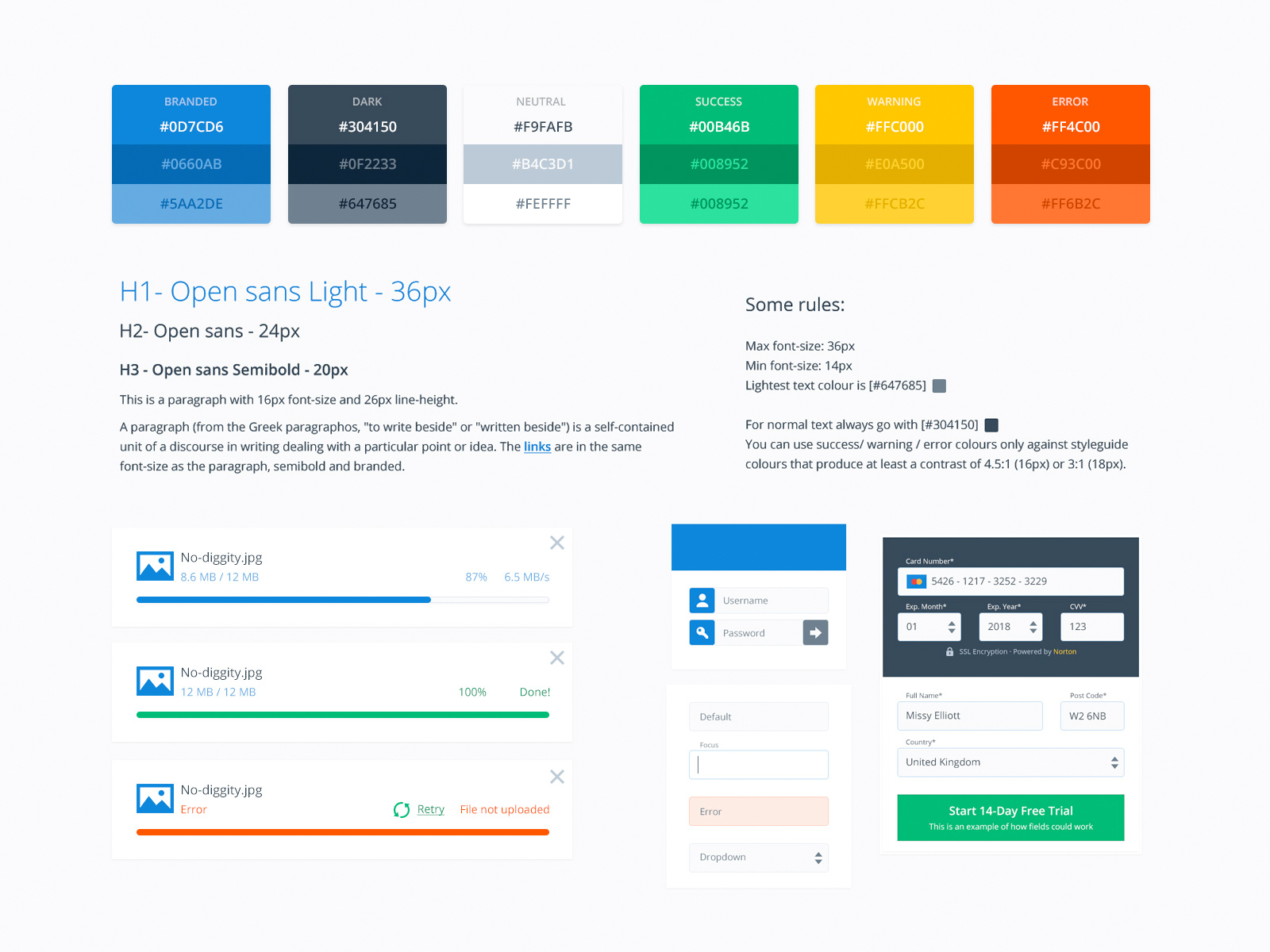
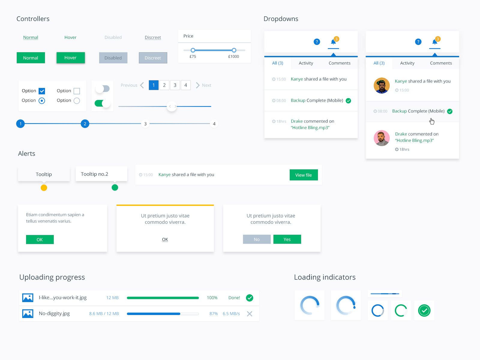
Inspired by modern design systems, such as Google's material design and Atomic design. The UI elements were designed to provide a unified and consistent look as well as future proof the UI we offer our users in any layouts that might arise in the future.
This UI Library provided the styling for common and interchangeable elements. From cards, shadows and dropdowns to buttons and notifications. These styles would then be used throughout our applications to create a more consistent and user friendly look.
Translating UI into Web components
To ease our development process and help the teams that work on the different aspects of the product, these UI elements were added into an in-house web styleguide within a common branded stylesheet.
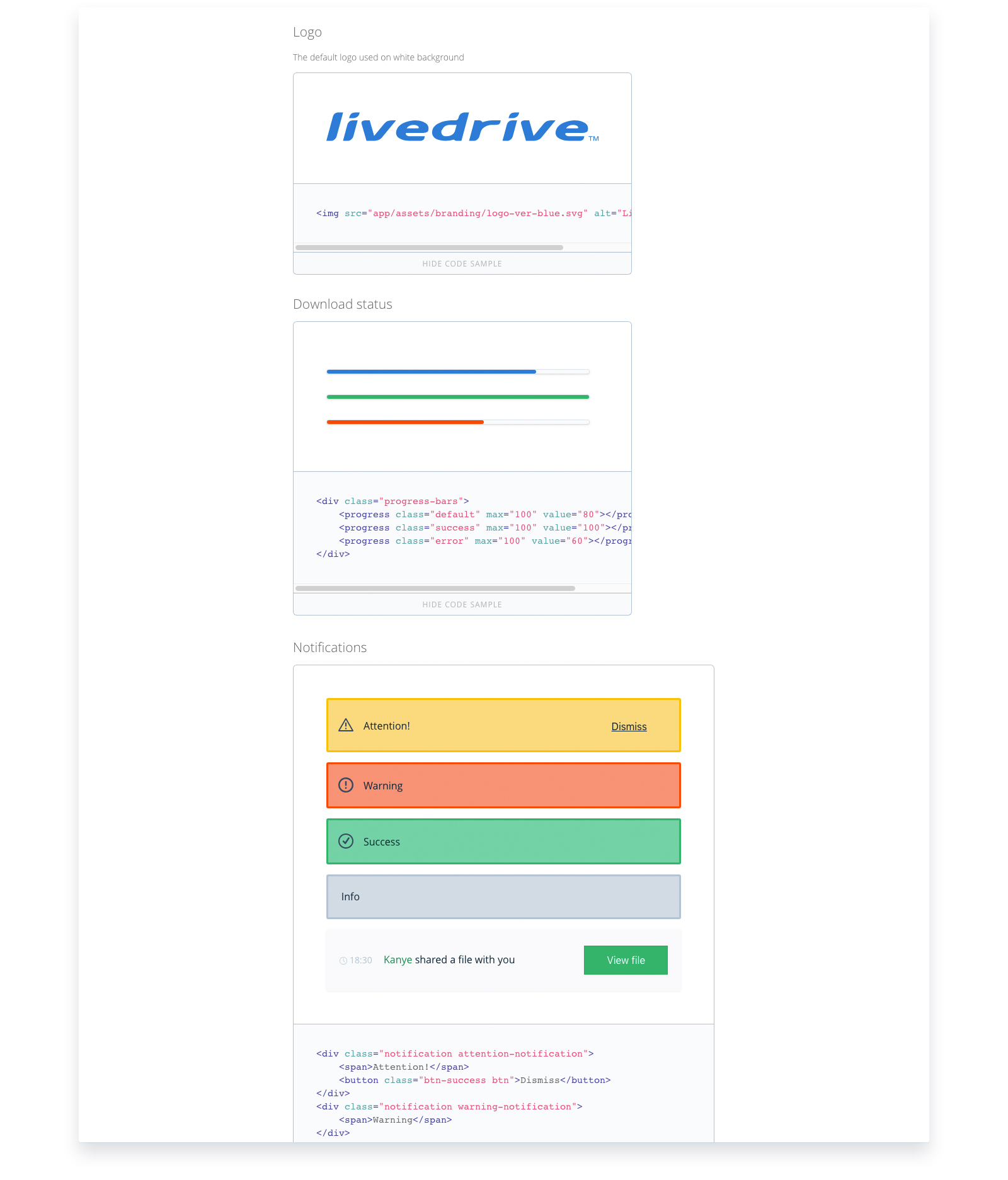
This way, every member of the team has access and can copy or utilise the necessary HTML that will form these elements.
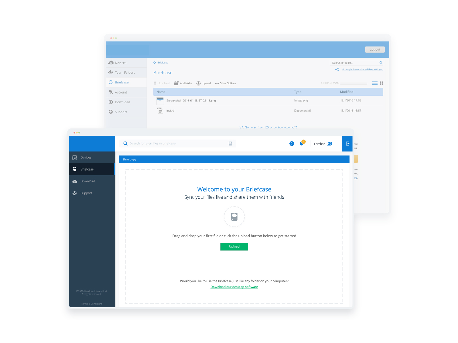
In action
This common "Design Language" is ever evolving and changing. So far it has been used in both web projects and native applications.
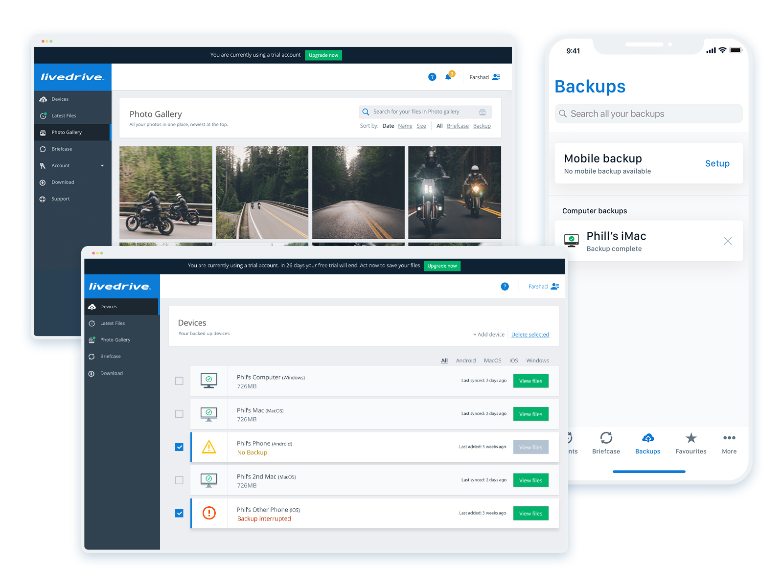
Consistency is now more apparent between our products and the new design rules are applied with each design iteration and improvements we do throughout development.
Conclusion
The biggest challenge for this project has been the creation of a unified scheme that can work across different channels and operating systems. With this guide in place we now have a better understanding of the look and feel we are trying to approach on each platform. While at the same time respecting the limitations that native operating systems have put in place.
This is an ongoing progress with the guide getting constantly updated with new elements. A roll-over in stages is currently in the work to slowly bring all products to follow a common design aesthetic.
Case Studies