Livedrive - Restore Feature
Improving the file restore functionality on the native desktop applications
The challenge: Improve and expand the Restore feature in the Livedrive dekstop app.
Platforms: MacOS & Windows desktop application
Toolkit: Stakeholder interviews, user research & testing, Balsamiq, Invision, Photoshop
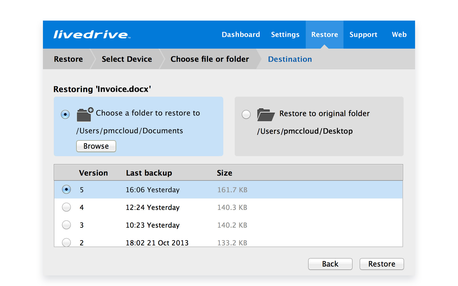
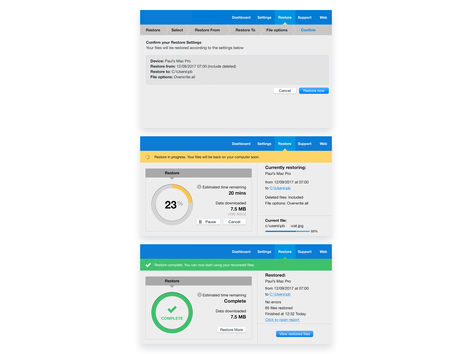
Livedrive's Backup feature offers the ability to restore a user's files via the native desktop application (macOS or Windows). The application had the ability to restore single files but not restore files en masse. A new feature to allow for that functionality was planned.
One that offers the ability to restore a big number of files at a time from a specific point in time. My role was to conduct the necessary research for the new feature, as well as add that extra functionality through design.
The mass restore feature could also prove useful to users that have been affected by ransomware and are therefore in need to recover a large number of files in their system.
Research
My first approach was to conduct a listening tour, this to discover pain points and get an in-depth knowledge of the capabilities of the product by team members and stakeholders that have worked on it in the past. I needed to figure out the limitations of the platform as well as what worked and what didn’t with the current restore functionality.
Since this was a new feature I also conducted a comparative/competitive study to figure out how other backup applications restore files. Prime examples of those were Windows Restore and Norton Online backup.
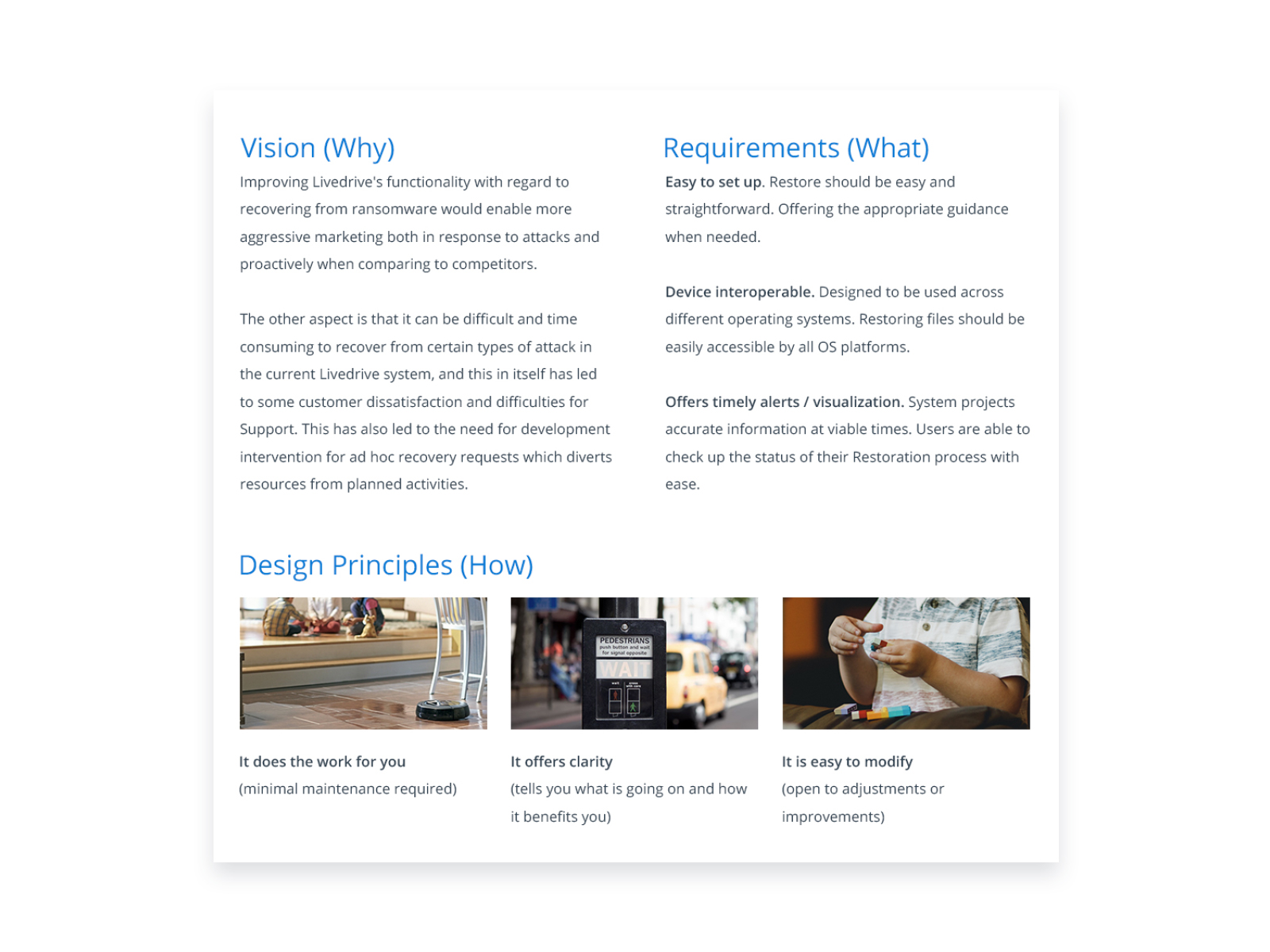
Based on the above I then compiled everything in one single design brief to identify as simply as possible the core vision and requirements of the feature. This helps me and the dev team visualise the direction we are going for. It also helps keep ourselves in line with the MVP.
Design
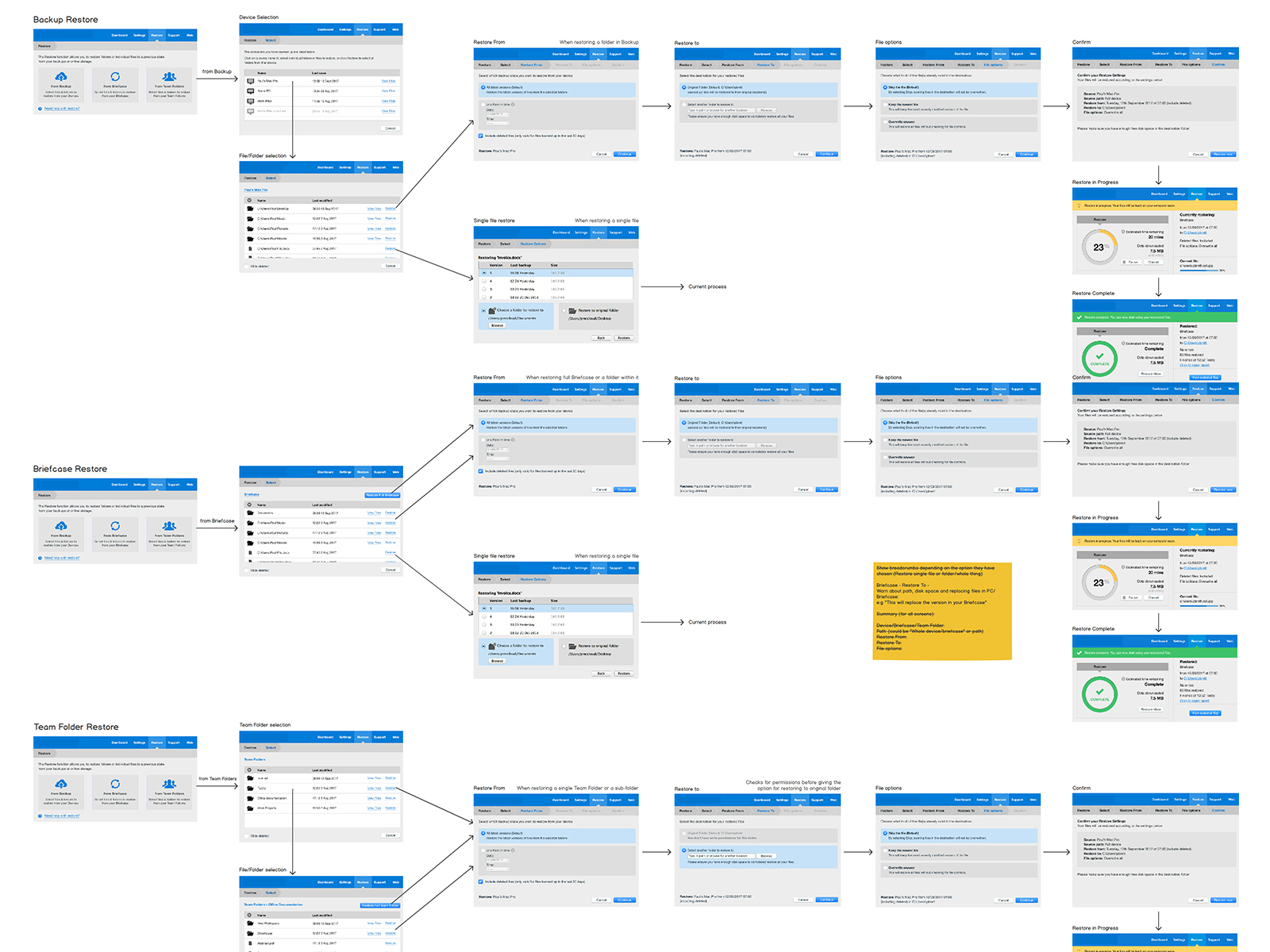
Wireframes
Since this was a new feature, the first need was to outline the user journey for the new feature.
This process included a lot of back and forth with the devs and product manager to ensure we are covering all potential scenarios and options the user might have and need.
With the user journey decided, I took to Balsamiq to explore the design for the flow of the restore feature.
Testing
I then took these wire-frames and compiled a working prototype in Invision, using Trymyui I tested it in stages with users (remotely), reiterating the designs after each feedback round.
User Testing Audience - The remote testing was conducted with 5 participants who matched our personas’ criteria and were completely new to the product. I tend to test with 3 to 5 users as any number of users beyond that tends to diminish results.
This provided us with a first operating MVP layout that these first-time users had no issues following.
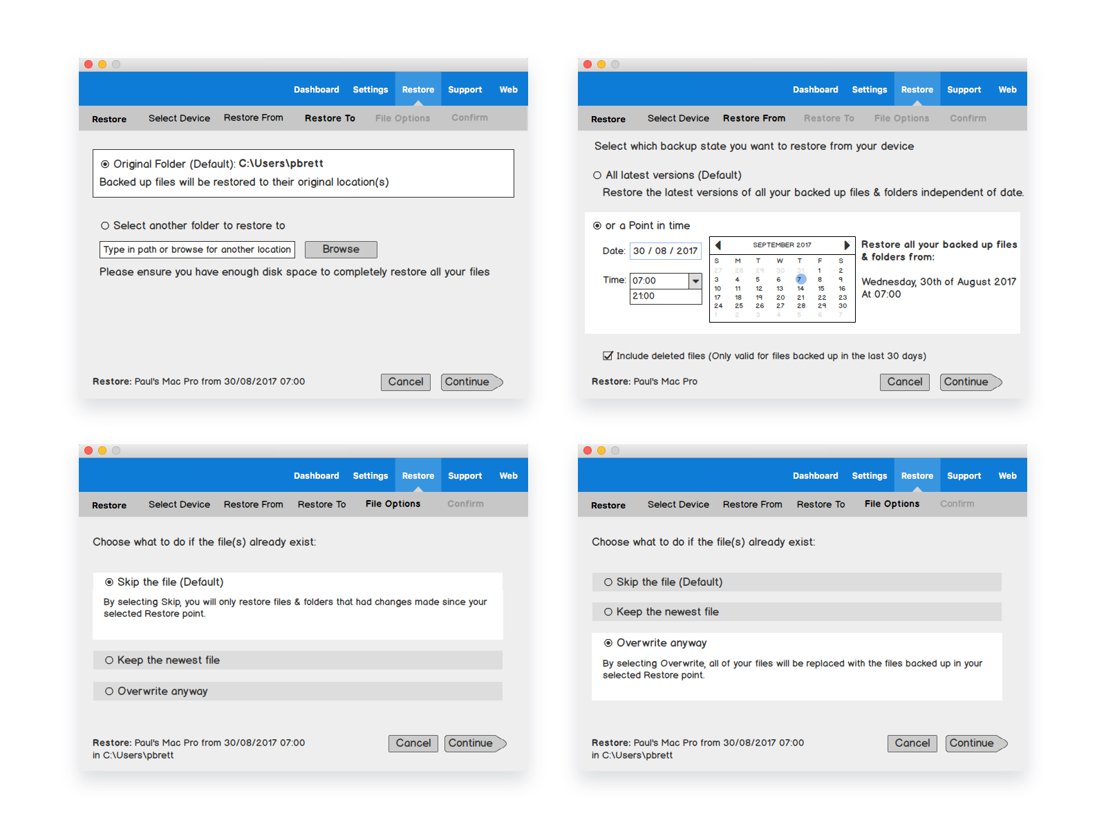
High Fidelity Design
The next step was high fidelity designs for all the screens as well as designing and separating the different user scenarios that the desktop application could support.
Last steps
With the high fidelity designs at hand I performed one more round of user testing to iron out any kinks left (and ensure we were still on the right path).
The full final user journey was updated and all scenarios were tested again with another 5 users new to the product. This to ensure we have covered all the necessary steps for the MVP and that the flow was not affected by the new designs.
You can explore the high fidelity prototype here.
Once the user journey was tested on the Mac OS environment, I then worked closely with our Windows OS developer to transfer the same feature in the windows OS design language. This helped ensure that the new feature was carried across our two native platforms consistently.
Results
This was a project that really forged our UX process with the agile methodology followed by the development team. It allowed us to introduce quick iterations of user testing in the development process.
The listening tour helped me get the team more involved in the project, but it has also given me some really good points for feature improvements in the future.
Additionally, the constant user feedback during the design stage ensured we are on the right path for our MVP.
For a feature that could be used in times of distress (i.e losing a large number of one’s files) this process proved invaluable.
At the time of writing, the feature is under development and due to launch in 2018.
Case Studies