Livedrive - Desktop application redesign
Modernising the native desktop experience
The challenge: Reassess and improve the overall architecture of the Livedrive native desktop application
Platforms: Native Windows & macOS desktop applications
Toolkit: User research, Comparative assessment, User testing, Balsamiq, Sketch, Invision, Zepplin
TLDR: The Livedrive desktop application had added a number of features over the years without scaling design, which ultimately led to a poor experience and unusable application.
Redesigning the desktop app solved most of the issues identified in the research phase. This was tested and implemented with a new look and feel.
Context
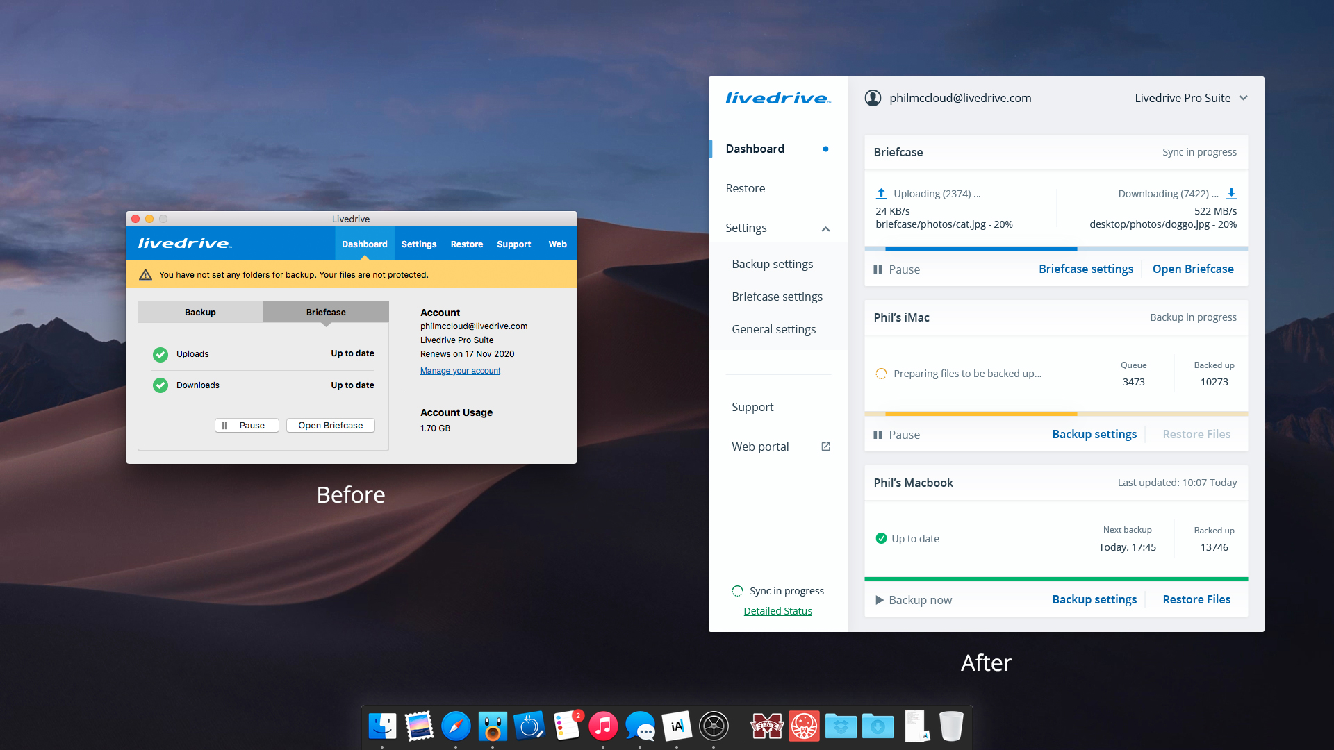
The Livedrive desktop application was first designed in 2013, since then it has gone through several updates with new added features. The design and usability of the application was due for a major overhaul that would bring it up to date with modern usability standards and ensure a level of future-proofing.
You can explore the high fidelity prototype that was tested here.
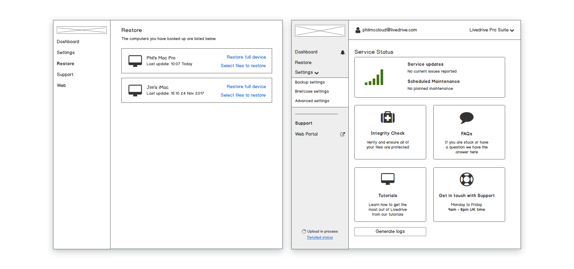
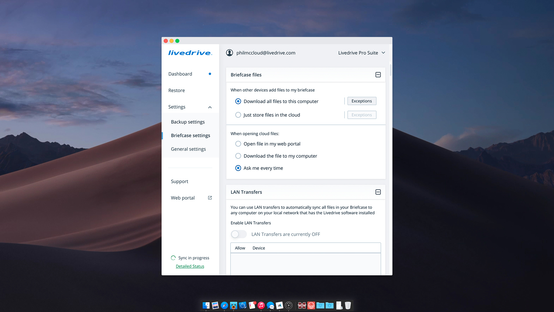
In the last few years, the Livedrive desktop application has been upgraded with several features and added functionalities. However, the UI has remained the same; a restrictive rectangular window laden with features.
With each patch and update, developers struggled with the scaling of the UI, which resulted in many functionalities in one small window, without the ability to resize.
This quickly became one the core issues of the application.
To solve this challenge, I decided to first assess the application, identify the user pain points and redesign the layout based on user expectations – and to future-proof the app, ensure a resizable window would be part of the solution.
Research
In the beginning, the team and I, made assumptions on the following pain points:
- UI could not be resized to adjust for new content and features
- Navigation was bulky, often needing multiple steps to reach or return to a function
- Content hierarchy was often inconsistent with options hidden under unrelated menus
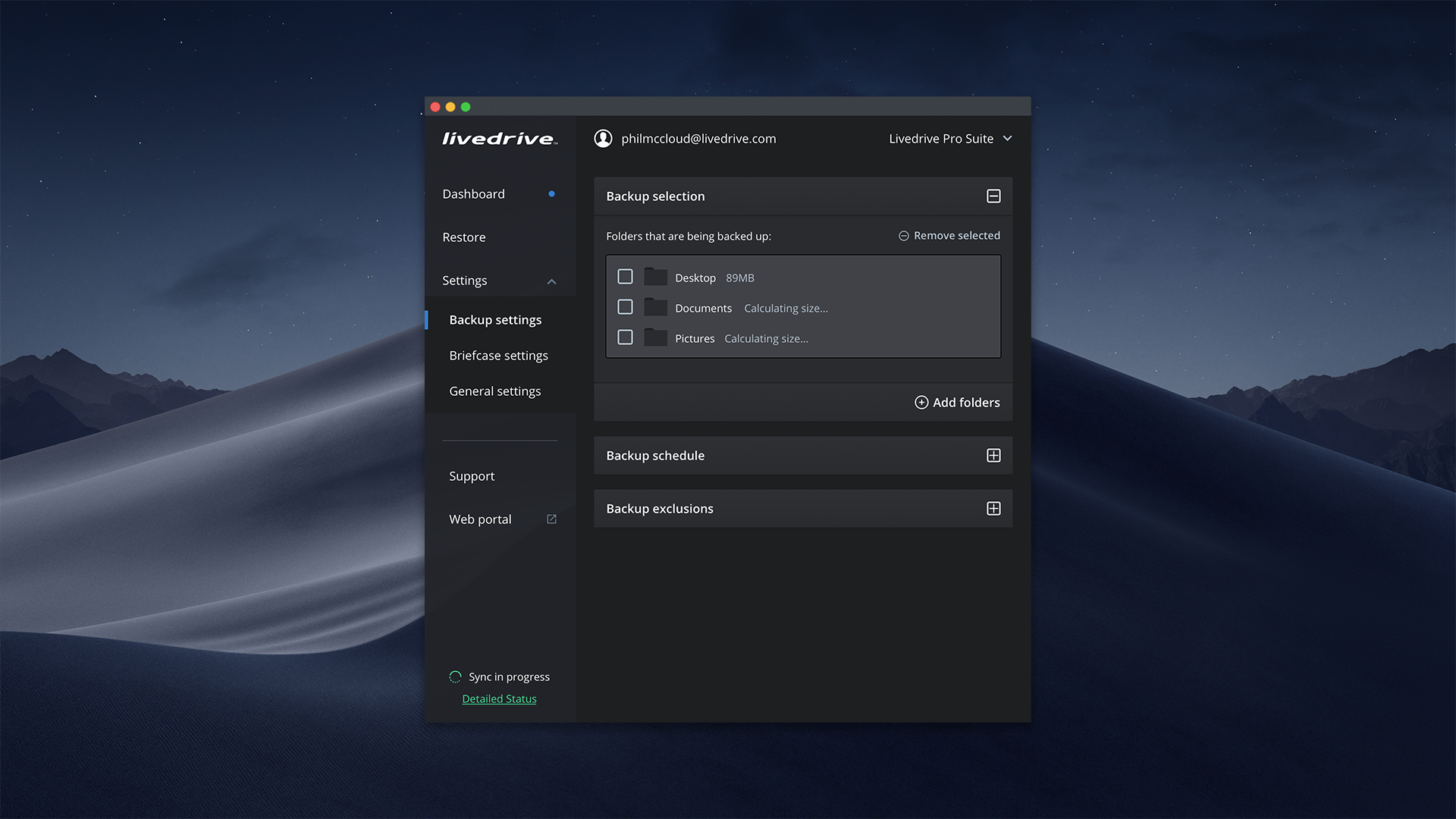
- Folder navigation and selection was cumbersome e.g you could only add one folder at a time for backup
- (Internal) Technical debt increased greatly with every iteration - new features came with more effort to figure out where to place them.
It was clear that even though this was a powerful product, the UI and usability was subpar to the point where it restricted the actual development of the application.
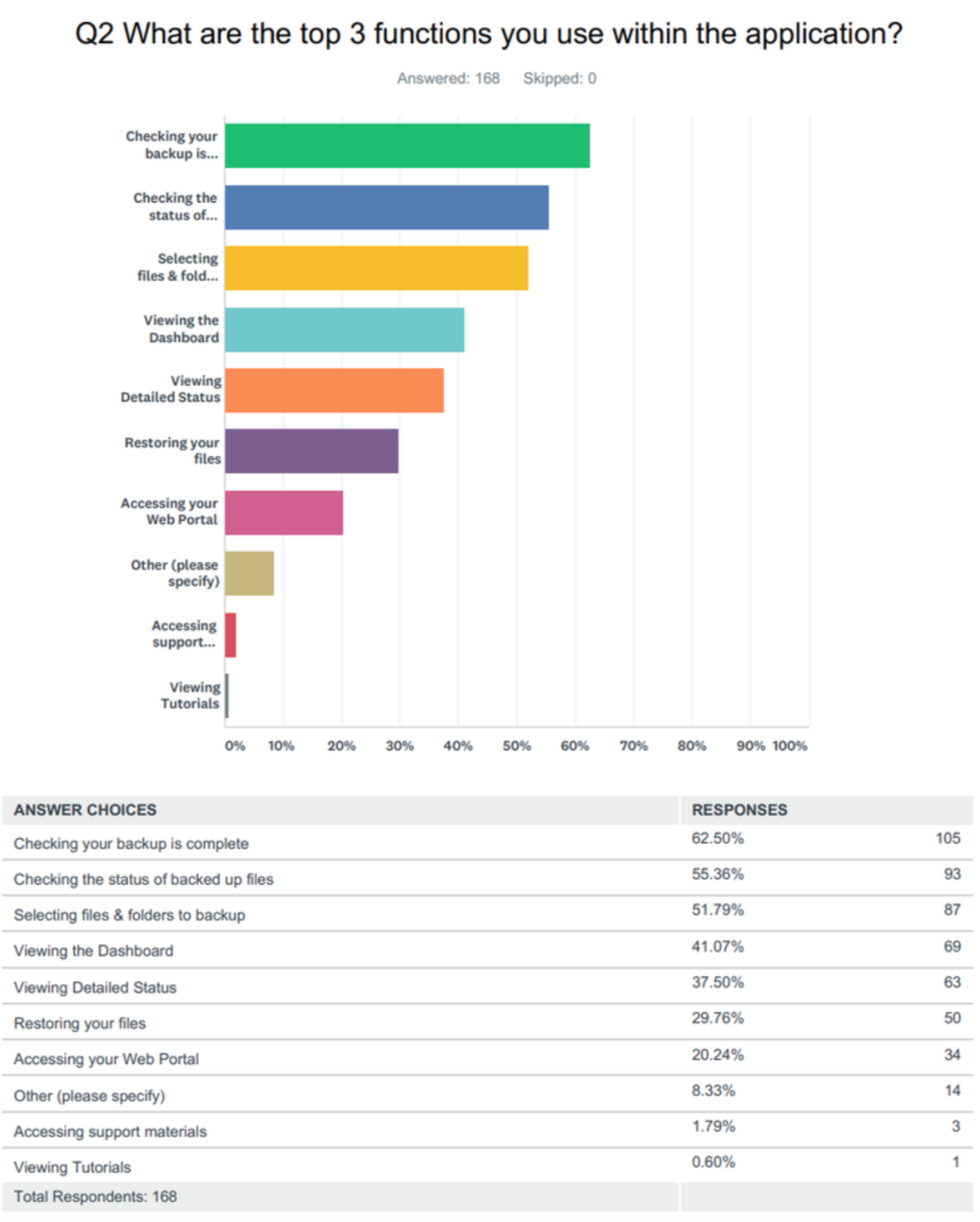
Through a collection of support tickets and earlier feedback. we already had a good idea of the issues that the desktop application faced. To collect more current and specific data, I conducted a user survey with both quantitative and qualitative questions to assess the state of the app.
The results suggested our assumptions were in line with the users’ pain points – UI Scalability, navigation and content hierarchy were key problems for the majority of our users. This was compiled in a lean report, which was shared with the wider team. And based on business, product and team roadmaps, we prioritise the list of pain points and fixes for the MVP.
Key pain points:
- Lacking detailed status – Not enough information on file progress, having to use the file integrity tool to ensure self that files have been uploaded, failed backups with no alert of any sort.
- Backing up folders – Difficult to browse and select, one at a time and selecting hidden folders is cumbersome.
- UI: Non resizable, hard to scrolls and browse, dated
- A number of users also mentioned that there was no sufficient onboarding and they did not know what steps to follow.
Prototyping
Wireframes
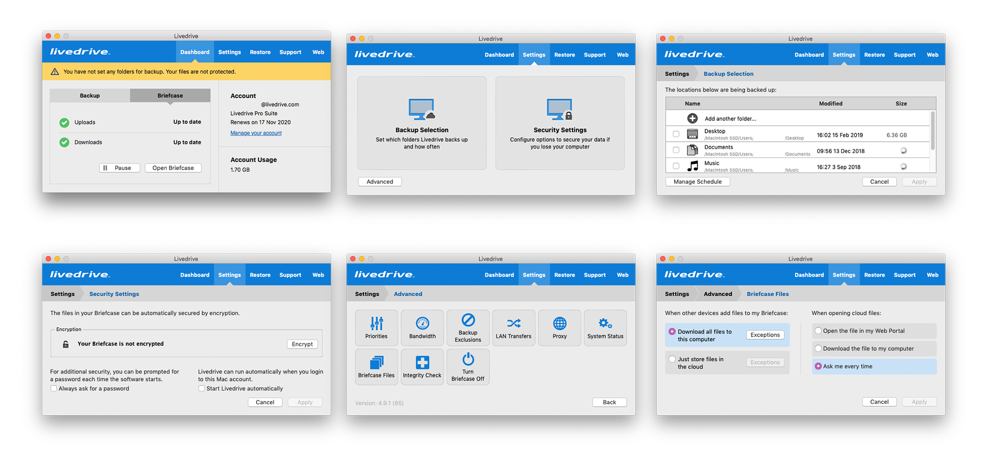
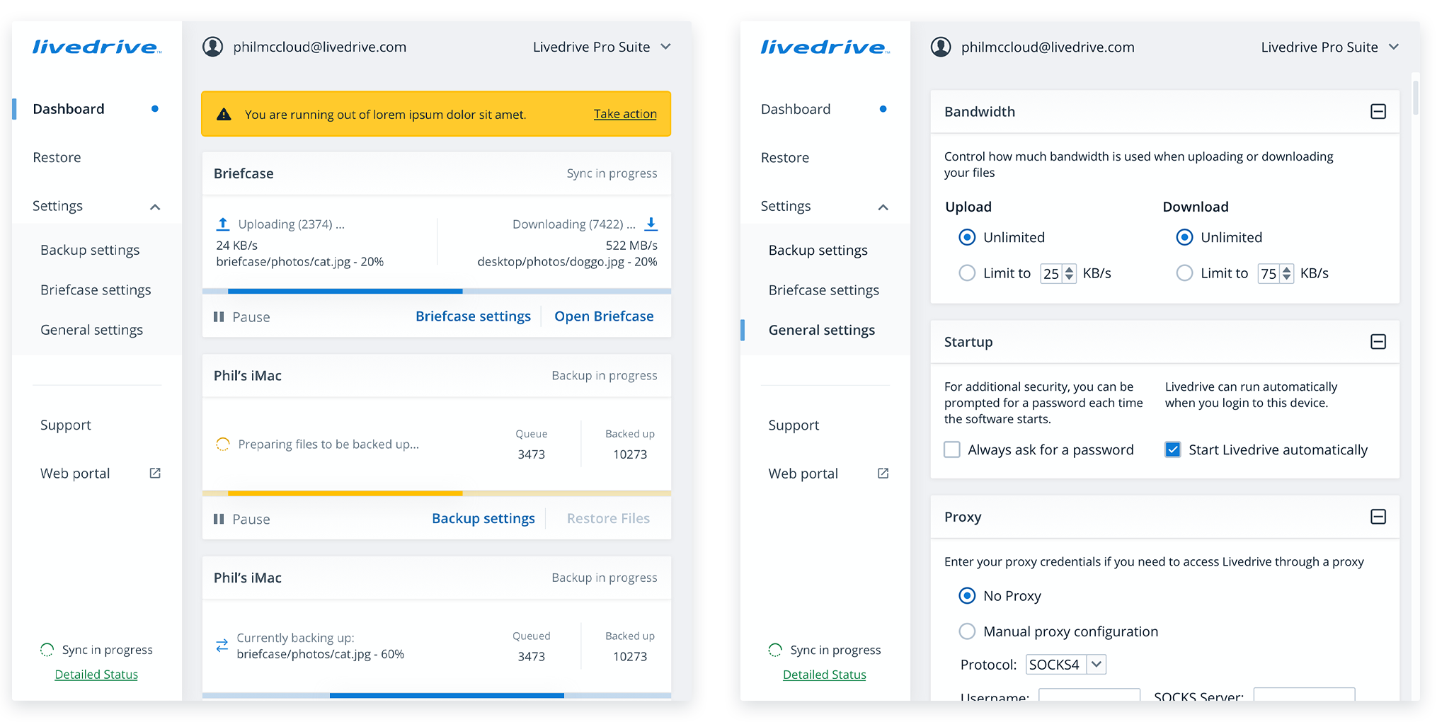
The wireframes created as part of this project aimed at fixing the core usability issues (e.g status, navigation) and the overall UI.
Turning the restrictive window into a resizable application window and adding modern design conventions solved most of the issues we uncovered during research.
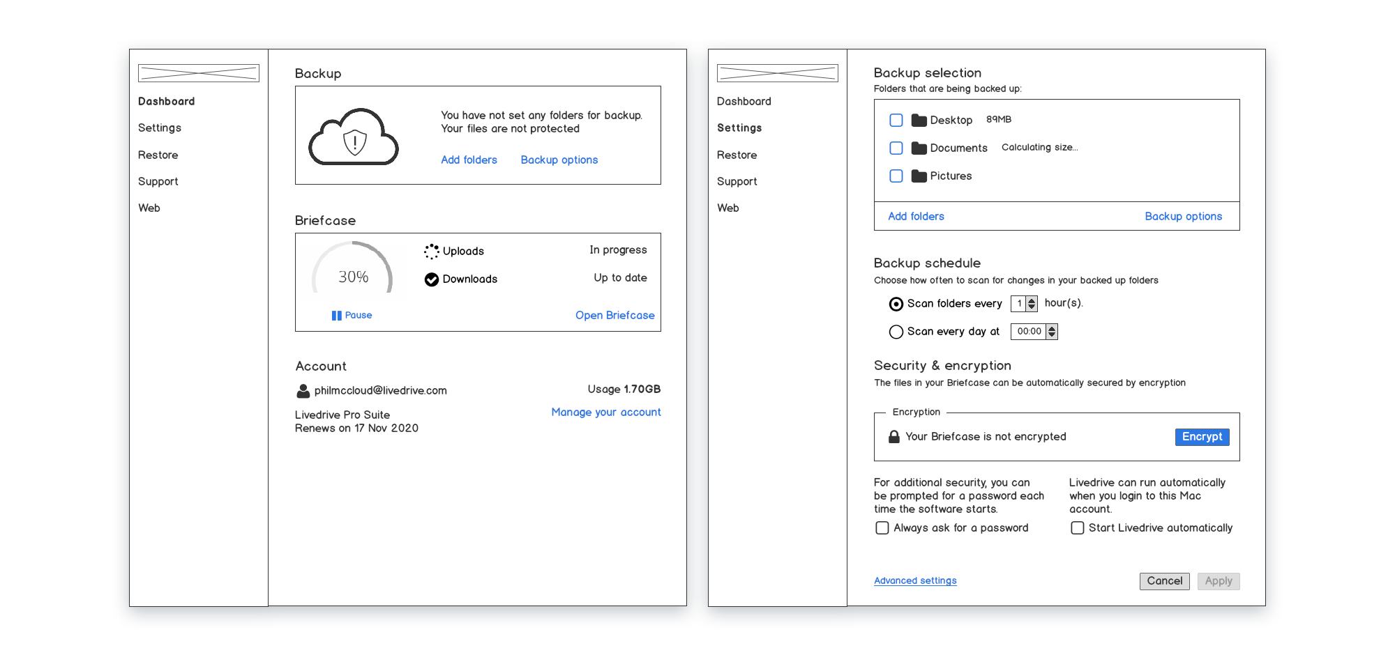
Wireframing was a fairly straightforward task. It needed to include things such as: persistent navigation, different available file views and more accessible controls.
Information was now visible and timely, whilst the content was also restructured with options and features that were grouped together in a logical way.
The new UI window now had a minimum size, whilst giving the users the ability to resize the window.
Once the wireframes had gone through a few iterations with the team, it was time for the high-fidelity design.
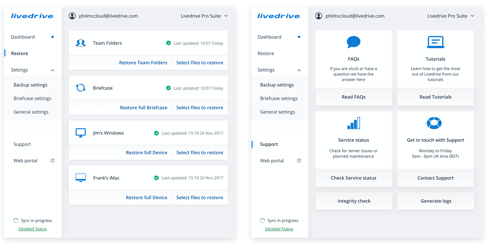
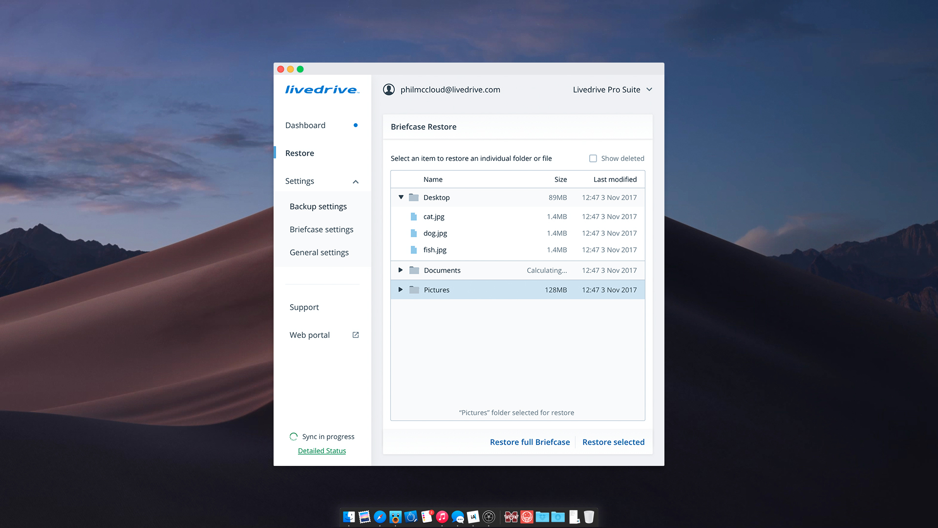
Design
The new app design was based on the Livedrive Design system. With consistency across typography and UI elements, the application was branded to look as a part of the Livedrive product family.
To ensure the designs worked, I conducted a series of user tests that followed the journey of a user installing the application and running the first back up.
You can explore the high fidelity prototype that was tested here.
Results
This was a challenging but a rewarding project. from the exploration and discovery stage to figuring out the finer details of building a desktop application.
The user testing results were all positive, with nominal pain points. The project was agreed to go into development.
It has been enjoyable as well to see a product that was really powerful yet limited by its own design, transform into a modern application worthy of today’s standards.
I would love to see further implementations in the future, where we look into ‘detailed status’ a bit deeper and we further improve how we communicate with users. It would also be interesting to introduce a “dark version” that could really give another level of customisability to our Mac users.
Case Studies